CSS has been around for a long time and its evolution was quite the ride. Nobody can deny that CSS is one of the most important tools in web development and, although it’s usually enhanced with various extensions, it’s a must-have on any modern website. Despite its undeniable importance, many developers are stuck using the same old techniques they learned “back in the day” and miss out on the cool new features it’s been collecting. This article is meant to give you a few CSS tips and tricks to up your game when it comes to styling your webpages. But first, a few words about its history.
Some CSS history.
It all started when Tim Berners-Lee proposed creating a global hypertext project in 1989, which materialized into the World Wide Web between 1991 and 1993.
Since early websites were meant to be browsed mainly by researchers, styling was of little concern. Websites were displayed as text-only pages viewed using simple line-mode browsers.
It took quite some time for styling to gain relevance while HTML was commonly used for both semantic and presentational purposes.
That all was about to change when HÃ¥kon Wium Lie proposed the idea of Cascading Style Sheets (CSS) in 1994. Thus, the first CSS version came into existence in 1996 and allowed web designers to change layouts, colors, and fonts on their websites.
Fast forward to 2022, CSS3 is still the current standard and has had a lot of features introduced throughout the years since its release in 1999.
Now let’s check out a few cool things we can do with CSS.

CSS Masking
Designers are familiar with the concept of masking. It’s all about creating a cutout of an image in a desired shape.
We all know the classic “border-radius: 9999px” to round out the corners of an image, but what if we would like to achieve a more complex cut?
It turns out you can use an image to mask another image. Say, for example, you would like to make a logo cutout of an image. All you have to do is use the mask-image CSS property on the image like so:
HTML
<div class=”masked_div”>
<img src=”image_bg.jpg”>
</div>
CSS
.masked_div {
-webkit-mask-image: url(softia_logo.svg);
mask-image: url(softia_logo.svg);
-webkit-mask-repeat: no-repeat;
mask-repeat: no-repeat;
}

It’s a pretty neat trick and it can give some great results if you animate the objects inside the mask.
Browser support:
Chrome: 4.0 -webkit-, Edge: 79.0 -webkit, Firefox: 53.0, Safari: 4.0 -webkit-, Opera: 15.0 -webkit-
Custom Text selection
These days, users expect top-notch UX and gorgeous UI, so as a web designer, why not go the extra mile?
Let’s say you have a website that involves users copying and pasting a lot of text. It could be a lyrics website, credentials sharing sections, code sharing site, custom-made blog editing tools, etc.
For those cases, here are two things you can do to enhance the UX and UI of your design:
Select all
You can use the user-select: all; syntax on a text element and by doing so, the user can select the whole text element with a single click.
.text-element {
user-select: all;
}
This can be quite useful when designing sections where you display usernames, passwords, addresses, emails, coupon numbers and other data that needs to be copied and pasted elsewhere.
Styling text selection
In the long list of first-world problems, up there with the best of them is the default browser styling of text selection. Depending on the browser, it may clash with your chosen color palette, and although it’s not a big deal for most websites, there are cases where text selection is a very common action.
There isn’t too much we can do about it, but at least we can change the default text color and background color of the selection. Just apply the following lines of CSS:
.new_color_selection::selection {
background-color: yellow;
color: green;
}
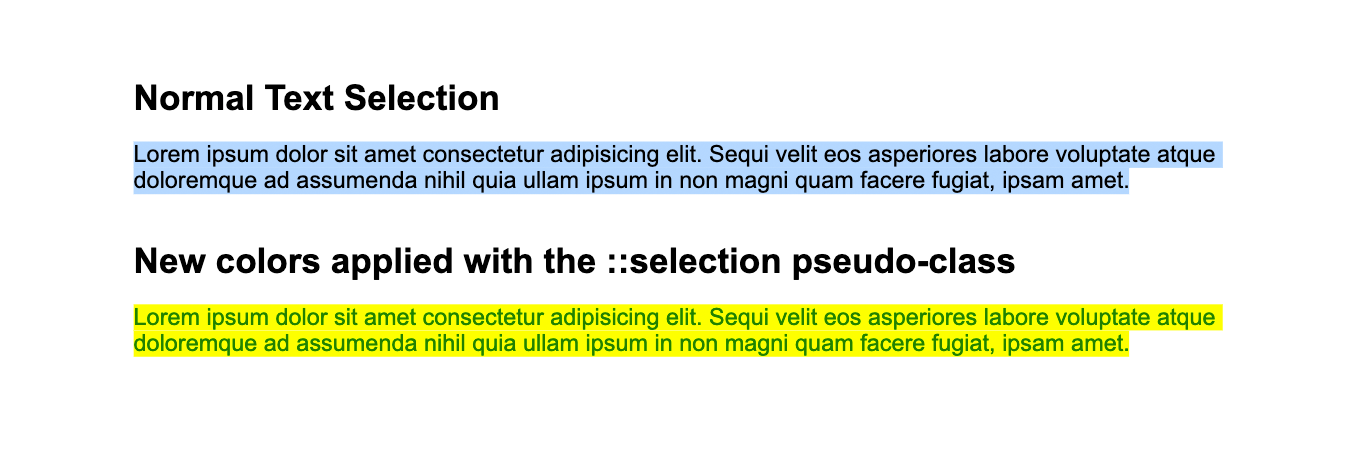
This way, you can better harmonize your text selection with the design.
Browser support:
Chrome: 4.0, Edge: 9.0, Firefox:62.0 / 2.0 -moz-, Safari: 3.1, Opera: 10.1
CSS Custom Properties
As you may know, we have been using CSS Preprocessors like SASS and LESS for quite some time. They are great tools for creating themes and they drastically improve the styling workflow.
One of the best features of CSS Preprocessors is the ability to declare and use variables. Well, modern vanilla CSS3 has given us the possibility of doing just that.
CSS Custom Properties are also referred to as CSS variables or Cascading Variables, and the syntax looks like this:
.container {
–nice_color: #449f82;
}
You declare a variable by using the double dash before its name. In the example above, any element inside .container will be able to use the variable like so:
.container p {
color: var(–nice_color);
}
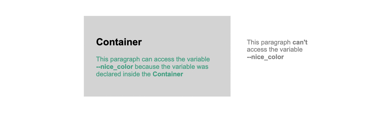
Now, every paragraph inside .container will have its color changed to #449f82.
Pretty cool!
Browser support:
Chrome: 49, Edge: 15, Firefox: 31.0, Safari: 9.1, Opera: 36.0
Extra tips
- Use text-overflow: ellipsis; on a container along with “white-space: nowrap;” and “overflow: hidden;” and if the line of text inside doesn’t fit, it will end in three points “…” indicating that there is more text inside the container but is not visible. (Add image)
- Html color hex codes are made of 6 characters, three groups of two values, each group representing R(red), G(green) and B(blue). The first value in a group is the main value and the second one is for fine-tuning. Values range from 0(zero) to f (1,2,3,4,5,6,7,8,9,a,b,c,d,e,f) where 0 is the darkest and f is the lightest. With these in mind, we can create our own color hex codes by imagining how much of the three colors we want to show. For example, we can create a simple red #aa0000, add 33 of green (#aa3300) to get a brownish color and add 55 of blue (#aa3355) to push it towards the purple part of the spectrum. Need just a bit more blue? Add to the second value of the group and get #aa335c. Need everything lighter? Add the same amount of value to everything (ex: +2 value to each group would be #ca537c). Want a neutral gray? Give every group the same value (ex: #3c3c3c). It’s pretty simple when you get the hang of it.
- Never use gray for lighter shadows because you may end up with backgrounds that are darker than your shadows, and obviously, that’s not good. Use rgba to define a transparent black. Ex: box-shadow: 2px 2px 5px rgba(0, 0, 0, 0.3); where “0,0,0” are the values for r,g and b yielding black, and “a” stands for “alpha” which represents opacity (values from 0 to 1 where 1 is completely opaque)

Since its release, CSS has come a long way and continues to evolve, constantly adding new features. Developers keep trying to find different ways to take advantage of what CSS has to offer and many of them come up with awesome results. That’s because CSS, as it is today, is already a powerful tool and the possibilities are vast. But knowing CSS tips and tricks such as these may set you apart from other developers and will surely take your work to another level.
Author: Claudiu Trăistaru